Company LOGO Design

  • สถานะ: Closed
  • รางวัล: $80
  • ผลงานที่ได้รับ: 161
  • ผู้ชนะ: siprocin

รายละเอียดการประกวด

Hello all,

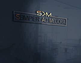
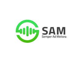
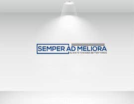
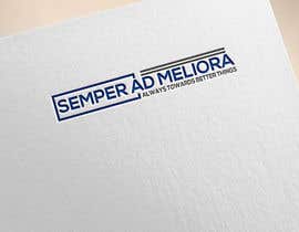
We are looking for someone to design a logo for our HEAD company Semper Ad Meliora. This company is the mother of the companies beneath it and speaks for everything we do as it stands for "always towards better things".

The logo needs to look professional and stand out as well as look neat and not completely over the top. You will be rewarded the prize money and we may help with a few freebies in the future as well as a thank you bonus plus any future work we need for more companies under our mother company will be pointed towards you firstly.

Let's see what you have got and remember we hope to be up there with the likes of the big IT group of companies within the next 5 years time at the very least but everyone needs to start somewhere much like all of us here so we hope to see some amazing talent.

Get to work and thank you to everyone for entering and your hard work, every entry will be individually looked at.

ทักษะแนะนำ

คำติชมจากผู้ว่าจ้าง

“Excellent designer, he won my competition. Very professional I would definitely use him again.”

รูปประจำตัว jtims88, Australia.

ผลงานอันดับสูงสุดจากการประกวดนี้

ดูรายการเพิ่มเติม

กระดานประกาศ

  • zwarriorx69
    zwarriorx69
    • 6 ปี ที่ผ่านมา

    And Just FYI ... you should go through these links to understand how some freelancers operate. cos u might get something similar to these as well or variations of the same, happens almost everytime ... http://www.gtgraphics.org/genericlogos.html
    http://www.gtdesigns.it/overusedlogos/
    https://www.crowdspring.com/blog/logo-design-branding-mistake-generic/

    • 6 ปี ที่ผ่านมา
  • zwarriorx69
    zwarriorx69
    • 6 ปี ที่ผ่านมา

    LOL https://www.freelancer.com/contest/Company-LOGO-Design-1283302-byentry-19876609.html https://www.freelancer.com/contest/Company-LOGO-Design-1283302-byentry-19872504.html
    https://www.freelancer.com/contest/Company-LOGO-Design-1283302-byentry-19876609.html the very fact that these are all similar to indicates that this is a generic style followed (not to be mistaken as a copy). And none are complaining about one copying the other, beacause they are very well aware that thesse are generic, so it's open game. In fact every entry here is generic.

    • 6 ปี ที่ผ่านมา
    1. zwarriorx69
      zwarriorx69
      • 6 ปี ที่ผ่านมา

      avoid variations of what we call the split logo format where the stalks of alphabets are used to break the name into parts , either as speech bubbles or as normal as these are all too common in innumerable contests. Case in point
      https://www.freelancer.com/contest/Design-a-Logo-for-an-App-Marketing-Agency-1193006.html
      https://www.freelancer.com/contest/Logo-Design-High-res-and-multiple-formats-1184455.html

      • 6 ปี ที่ผ่านมา
  • shahansah
    shahansah
    • 6 ปี ที่ผ่านมา

    please sir check#105#106#107#108

    • 6 ปี ที่ผ่านมา
  • ashik960
    ashik960
    • 6 ปี ที่ผ่านมา

    Check once : #26 #27

    • 6 ปี ที่ผ่านมา
  • tofayelahmed87
    tofayelahmed87
    • 6 ปี ที่ผ่านมา

    Dear Sir, This is my entry for this project, Very clean, professional, 100% original and eye-catching.Will be delivered in (EPS, AI, JPEG, PDF, PNG, PSD etc).Any changes in colors or fonts or anything is available for you, just tell me what do you want? Note- that you will have a lifetime guarantee for the logo, you can ask me for changes in the future Completely free. Please leave a feedback and rating for me. Thank you

    • 6 ปี ที่ผ่านมา

แสดงความคิดเห็นเพิ่มเติม

วิธีเริ่มต้นจัดการประกวด

  • ประกาศการประกวดของคุณ

    จัดการประกวดของคุณ รวดเร็วและง่ายดาย

  • รอรับผลงานจำนวนมหาศาล

    รอรับผลงานจำนวนมหาศาล จากทั่วโลก

  • มอบรางวัลให้แก่ผลงานที่ดีที่สุด

    มอบรางวัลให้แก่ผลงานที่ดีที่สุด ดาวน์โหลดไฟล์ - ง่ายดาย!

โพสต์การประกวดตอนนี้เลย หรือเข้าร่วมกับเราวันนี้!