
michklprime
Cameroon

Our accounting software has been built over the last 20 years into a large product, but we have been locked into the design elements that were provided in the original Windows style. Originally, we had an award winning interface, however although it's extremely functional and easy to use, it's now starting to feel a bit dated. I would like have the interface of the application updated, to create a new (preferrably unique) style that maintains the ease of use but also modernises the experience for the users.
----
Update:
To clarify, the software is finished and functional, this is not a design for a future app (with placeholder content), it's an update for an existing app.
What's primarily missing is the user experience. Instead of presenting functional information, eg a dashboard, it's just masses of field and grid based information.
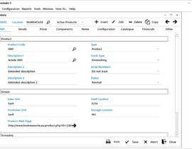
I have attached a full set of the tabs of the Inventory module (49 tabs in all) so you can see the amount of information that the application has, and this is increasing all the time as more features are added.
For example, the screenshots on Sales Force https://www.salesforce.com/au/products/ show the same volume of information, just presented with colour, whitespace and a more understandable layout.
----
In regards to the contest, it's not my goal to have someone design 400 forms for $250. It's for someone to come up with the look and feel for the application in just a few pages. This is similar to other contests where you need different kinds of pages, but that one page can suit many tasks and give an idea of what the application 'feels' like.
If the contest is awarded, I will work out a seperate contract with the winner for the design of the full product, and that will be a seperate, paid job. This will be completed piece by piece, as once the basic design elements are worked out a lot of the forms can be updated easily as they don't contain many elements.
----
This is a desktop application, so is restricted to operating in the desktop environment. That being said, some elements of web design should be able to be incorporated if the appropriate programming controls can be found.
The software is written in Delphi and consists of over 350 forms, so there is a massive scope for the project. The software is all tab based, with a 'module' containing tabs of all the information relating to the product, invoice, customer, etc. As the software grows we are finding that we are in a bit of a 'tab-hell', where we have to just keep adding further layers of configuration and information.
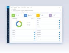
The software starts as a form with the menu on top and actions at the bottom. Modules are accessed from the menu or the row of module icons at the very bottom. You can see this on the 'Main Interface' picture. The application is MDI, you can open as many modules as required and they all operate within the application space. 'Module 1' and 'Module 2' are examples of open modules.
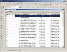
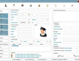
Being accounting software, the interface consists primarily of grids and fields, shown in 'Grid Example', 'Grid and Fields Example' and the 'Module 1' and 'Module 2' pictures, as well as dialog boxes for input and operation, shown in 'Simple Dialog' and 'Complex Dialog'.
All parts of the software are able to be resized, however this only expands the field sizes and doesn't enlarge the fonts. We are finding that this is a problem on higher resolution monitors, so incorporating some kind of scaling option into the design is important. This would be managed in code but integral to the design.
There so many parts to the program it is impossible to present them all here. Initially we are running this as a contest to find what people can see as being possible with the basic structure of the program.
If successful, the winner will be engaged on an additional job basis to work through the entire program and all of the forms. This process will be completed over a period of time, as each part of the program is updated.


จัดการประกวดของคุณ รวดเร็วและง่ายดาย

รอรับผลงานจำนวนมหาศาล จากทั่วโลก

มอบรางวัลให้แก่ผลงานที่ดีที่สุด ดาวน์โหลดไฟล์ - ง่ายดาย!