Design a Gaming Clan Logo

  • สถานะ: Closed
  • รางวัล: $50
  • ผลงานที่ได้รับ: 38
  • ผู้ชนะ: turbulencija

รายละเอียดการประกวด

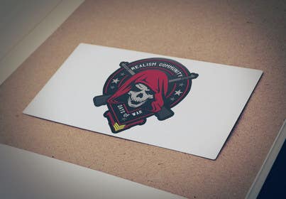
I am needing a logo made for a gaming community called "Days of War Realism Community". The focus should be "Realism Community" or even a simple "RC" or "DOW RC". If you can get "Days of War" in there then that is just a added bonus.

Logo can be a creative usage of text alone or can be military themed like a arm patch, military unit crest, completely made up design like in the website below....anything goes pretty much.

Size needs to be 500x500 (can be png with no background).

__________________________________________________________________

The game is a WW2 based game using American, German, Soviet and British forces. It is called "Days of War".

The Realism Community is a community set up for Realism Unit Clans. Realism Unit clans favor reenactment more than clan play. Meaning they like a militaristic look over a clanny look, so designs that mimic military unit patches or very clean and polished text styles.

I have yet to decide what kind of theme the website will have, but I am favoring looking at creating the theme around this theme: http://www.wwiiguns.com/

I appreciate all entries. I will be blunt in letting anyone know if I like it, don't like it, are on the right or wrong path, etc.

__________________________________________________________________

If you are stuck trying to go a militaristic route, a normal logo like you would make for a business could work as well like some random one from another contest here: https://cdn3.f-cdn.com/contestentries/901356/19679968/584448153bd79_thumb900.jpg

ทักษะแนะนำ

คำติชมจากผู้ว่าจ้าง

“Great freelancer!”

รูปประจำตัว Switzd0d, United States.

กระดานประกาศ

  • adsis
    adsis
    • 7 ปี ที่ผ่านมา

    for entry #75 , every feedback are always welcome.... Thank You.

    • 7 ปี ที่ผ่านมา
  • marvinbaldemor36
    marvinbaldemor36
    • 7 ปี ที่ผ่านมา

    any feedback for entry #70 would be appreciated thanks !

    • 7 ปี ที่ผ่านมา
  • Switzd0d
    ผู้จัดการประกวด
    • 7 ปี ที่ผ่านมา

    I believe I have narrowed down exactly what I am looking for and can offer more clear examples of how it should look. Apologies for being so picky. There have been a lot of entries I LOVE, but there is just something about them that turn me off as well.

    1. The main area of the logo needs to display something militaristic and/or unifying. By unifying, I mean the community I run caters to like minded military reenactment groups from the following countries represented in the game we play: American, German, British and Soviet.

    These two images capture that feel the best and offer a easy way of being able to list all four countries. The only think I do not like about the images is the wreath around them and lack of background. (See next comment)

    • 7 ปี ที่ผ่านมา
  • Switzd0d
    ผู้จัดการประกวด
    • 7 ปี ที่ผ่านมา

    http://blog.spoongraphics.co.uk/wp-content/uploads/2013/emblem/39.png
    https://s-media-cache-ak0.pinimg.com/236x/9c/f6/05/9cf605c983a6bb41f843214af52ed91a.jpg
    (Note, if you go with the chevrons, do them like in this image) - https://thumb1.shutterstock.com/display_pic_with_logo/4217110/407836357/stock-vector-set-of-military-and-army-patches-and-badges-407836357.jpg

    • 7 ปี ที่ผ่านมา
  • Switzd0d
    ผู้จัดการประกวด
    • 7 ปี ที่ผ่านมา

    2. The next thing is the crest shape. For best reference, use an actual military unit emblem such as any found in this search: https://www.google.com/search?q=real+military+unit+emblems&biw=3440&bih=1261&source=lnms&tbm=isch&sa=X&ved=0ahUKEwikntXx9aDRAhXH2yYKHdG2A48Q_AUIBigB

    Some of the ones (shapes) I like most are:

    http://images.vector-images.com/0/14835.jpg
    http://www.italy.army.mil/graphics/logos/garrison_logo.png
    https://militaryspecialties.com/wp-content/uploads/2015/03/Washington-Crest1.jpg


    3. Depending how it looks, size, shape, etc. Swords or Crossed rifles either under the design or incorporated into the design are a plus.

    4. Finally, the text used needs to be like the emblems in the first image. Nothing with very sharp edges or new age looking. However, would still like some clever use of the text and not simply a slight curve or straight line. Plus, the "RC" can still be made into a logo if your design looks like it would be a good fit.

    • 7 ปี ที่ผ่านมา
  • marvinbaldemor36
    marvinbaldemor36
    • 7 ปี ที่ผ่านมา

    Kindly check #59 and # 60, please give your feedback. thank you!

    • 7 ปี ที่ผ่านมา
  • marvinbaldemor36
    marvinbaldemor36
    • 7 ปี ที่ผ่านมา

    Kindly check #54

    • 7 ปี ที่ผ่านมา
  • marvinbaldemor36
    marvinbaldemor36
    • 7 ปี ที่ผ่านมา

    im working on a new one sir. please wait for my entry thanks!

    • 7 ปี ที่ผ่านมา
  • AzaharNOH
    AzaharNOH
    • 7 ปี ที่ผ่านมา

    Check Entry #49 pls.thx ;)

    • 7 ปี ที่ผ่านมา
  • Switzd0d
    ผู้จัดการประกวด
    • 7 ปี ที่ผ่านมา

    To all entered, I have decided on the new website theme to go with. This may or may not help you with color choices or direction. http://3rdmarines.org/images/dow_forums_mockup_5.jpg

    • 7 ปี ที่ผ่านมา
  • marvinbaldemor36
    marvinbaldemor36
    • 7 ปี ที่ผ่านมา

    Hi! Kindly check #35 . thanks!

    • 7 ปี ที่ผ่านมา
  • Switzd0d
    ผู้จัดการประกวด
    • 7 ปี ที่ผ่านมา

    Thank you all for your entries so far! They are looking great! A little reminder (and maybe a helpful tip), imagine this logo on a wall of a building inside a military base. It should not be too flashy, but it should also show a lot of detail/design was put into it. Then of course, military themed.

    Use stars, crossed rifles, sniper scopes, rank chevrons, swords, knives...

    • 7 ปี ที่ผ่านมา

แสดงความคิดเห็นเพิ่มเติม

วิธีเริ่มต้นจัดการประกวด

  • ประกาศการประกวดของคุณ

    จัดการประกวดของคุณ รวดเร็วและง่ายดาย

  • รอรับผลงานจำนวนมหาศาล

    รอรับผลงานจำนวนมหาศาล จากทั่วโลก

  • มอบรางวัลให้แก่ผลงานที่ดีที่สุด

    มอบรางวัลให้แก่ผลงานที่ดีที่สุด ดาวน์โหลดไฟล์ - ง่ายดาย!

โพสต์การประกวดตอนนี้เลย หรือเข้าร่วมกับเราวันนี้!