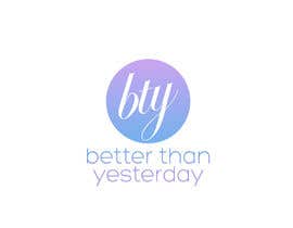
Design a Logo for Better Than Yesterday
- สถานะ: Closed
- รางวัล: $300
- ผลงานที่ได้รับ: 14
- ผู้ชนะ: kevincc18

รายละเอียดการประกวด
I'm starting a brand for photography (attractive women models) and fine art (landscapes, flowers, cities) called Better Than Yesterday. It's a lifestyle brand bringing to mind keywords like: young, free, beauty, innocence, and happy. BTY models are not distant or vapid, but instead approachable, friendly, fun, and sometimes serious and aspirational. A clear focus on the good, simple, and true. Landscapes are focused on beauty and the achievements of man and aspirations for a better future. So hopefully this description can inform your decisions when creating the logo. The logo will be used on the website as well as at the bottom right corner of photos/art (similar to an artists signature) - so it should be simple, but easily recognizable as ours. Thank you.
ทักษะแนะนำ
คำติชมจากผู้ว่าจ้าง
“Excellent work on getting this logo just right. This is a designer who knows how to add the little details that you didn't think of to represent the feelings you need in the logo for the target audience”
![]() iceman333, United States.
iceman333, United States.
กระดานประกาศ
-

indraDhe
- 10 ปี ที่ผ่านมา
Congratulations to @ kevincc18
Thank you @ iceman333 for appreciation given- 10 ปี ที่ผ่านมา
ดูอีก 1 ข้อความ
-

DigiMonkey
- 10 ปี ที่ผ่านมา
Power to female audience!!
Nice contest.- 10 ปี ที่ผ่านมา
-
indraDhe
- 10 ปี ที่ผ่านมา
Ok. Thank's @iceman333
- 10 ปี ที่ผ่านมา
-

f0tis
- 10 ปี ที่ผ่านมา
Thank you for your rating on #187 , please check the link below for a white font variation.
Feel free to ask for any revision.
http://img69.imageshack.us/img69/3382/93992276.png- 10 ปี ที่ผ่านมา
-

Aflitunov
- 10 ปี ที่ผ่านมา
I didnt make it fast enough but here is the logo I think it looks nice:
http://i164.photobucket.com/albums/u14/ProjectDesigns/bty_zpsf64860fc.png- 10 ปี ที่ผ่านมา
-

davimarz
- 10 ปี ที่ผ่านมา
Hi, pls check #273 , tnk
- 10 ปี ที่ผ่านมา
-
davimarz
- 10 ปี ที่ผ่านมา
pls #276 #274 tnk
- 10 ปี ที่ผ่านมา
-

jeganr
- 10 ปี ที่ผ่านมา
hi please see my design and full view & feedback 267, 268,269,270,272
- 10 ปี ที่ผ่านมา
-
davimarz
- 10 ปี ที่ผ่านมา
nice ;)
- 10 ปี ที่ผ่านมา
-

laineManalese
- 10 ปี ที่ผ่านมา
hi please see my design #239 #240 thanks
- 10 ปี ที่ผ่านมา
-

shamim550
- 10 ปี ที่ผ่านมา
Please see #242,#243,#244 and #253 Thanks
- 10 ปี ที่ผ่านมา
-
shamim550
- 11 ปี ที่ผ่านมา
Please give me feedback #215 Thanks.
- 11 ปี ที่ผ่านมา
-

itcostin
- 11 ปี ที่ผ่านมา
please check #176, #177. Read PM. Thanks!
- 11 ปี ที่ผ่านมา
-
mayalogic
- 11 ปี ที่ผ่านมา
please see #151 #152 #153 #154 and #155
- 11 ปี ที่ผ่านมา
-

javlaks
- 11 ปี ที่ผ่านมา
please check my designs. #131 and #133. Simple, beauty, fresh and original. I'm awaiting for your feedback. We can make any change. =)
- 11 ปี ที่ผ่านมา
-

knb2001
- 11 ปี ที่ผ่านมา
Hi, would you please give me feedback for #76. ? Thank you.
- 11 ปี ที่ผ่านมา
-

nad300882
- 11 ปี ที่ผ่านมา
hi! please take a look at #95 and submit feedback in order to upload variations. respect! tks!
- 11 ปี ที่ผ่านมา
-

ผู้จัดการประกวด - 11 ปี ที่ผ่านมา
Thank you for the entry - this particular logo is more about the text presentation than any symbol or picture-based logo designs
- 11 ปี ที่ผ่านมา
-
nad300882
- 11 ปี ที่ผ่านมา
tks for feedback, I'll try another approach for you!
- 11 ปี ที่ผ่านมา
-
mayalogic
- 11 ปี ที่ผ่านมา
Please check #119 #120 & #121. Thanks
- 11 ปี ที่ผ่านมา
-
ผู้จัดการประกวด - 11 ปี ที่ผ่านมา
Thank you for the submissions - I can't have any women or shapes like that in the design - mostly the design needs to communicate inspiration/playful/fun to women only in how the text is presented and using colors that are commonly used in prominent womens brands - I got this idea to look at sites like Oprah after I had posted the project, so since then I have been trying to better guide people in the comments and also by publicly showing the top choices so far
- 11 ปี ที่ผ่านมา
-
shamim550
- 11 ปี ที่ผ่านมา
Please feedback me #89 Thank you.
- 11 ปี ที่ผ่านมา
-
ผู้จัดการประกวด - 11 ปี ที่ผ่านมา
A more "open" design is preferred to the enclosed oval apsect - but even if it were taken away, it's not a better execution than the similar #70 .
- 11 ปี ที่ผ่านมา
-

yemiistudio
- 11 ปี ที่ผ่านมา
hi pls show #39
- 11 ปี ที่ผ่านมา
-
ผู้จัดการประกวด - 11 ปี ที่ผ่านมา
Your butterfly concept is very good and interesting, but what was not right here was the text display. It is too blocky and stuff - the new designs are focusing more on a female-friendly, playful vibe
- 11 ปี ที่ผ่านมา
-
AnaisCR
- 11 ปี ที่ผ่านมา
Hi! Just posted #74 An inbetween woman and landscape. Tell me what you think about it, any indications is welcome! Thank you!
- 11 ปี ที่ผ่านมา
-
AnaisCR
- 11 ปี ที่ผ่านมา
Sorry, actually #83 and #84 No idea why I would put a "w" instead of a "y". At least now I know I use the abbreviation for "by the way" too much. ;)
- 11 ปี ที่ผ่านมา
-
ผู้จัดการประกวด - 11 ปี ที่ผ่านมา
Thank you - I did not reject these because they were "bad" - it's just that my original ideas of color scheme where flawed as I realized the best way to talk to women would be to look at the colors and styles they use on a large womens site such as Oprah - so that is why the highest rated designs now reflect that. Also, in particular to the ones you submitted, the text was a bit too difficult to read, the large part kinda looking like "bry" - I just don't see it instantly "pouring" into people's minds
- 11 ปี ที่ผ่านมา
-

mahtabvakily
- 11 ปี ที่ผ่านมา
sorry but 38 is copy,http://t3.gstatic.com/images?q=tbn:ANd9GcTsWypfGc3VMcPv_75rfLZyeAVYadvASrvUw2KqAZabvdOJFGt9mw
- 11 ปี ที่ผ่านมา
-
SaapeXD
- 11 ปี ที่ผ่านมา
Need more data / info to make one! Eg: Colour preferences, what you want to see in the logo etc...! Thanks! :D
- 11 ปี ที่ผ่านมา
-
ผู้จัดการประกวด - 11 ปี ที่ผ่านมา
Sure, no problem. If you go to PaneraBread.com and OliveGarden.com you can see the types of TAN color they use there for their background. Panera uses a light one and Olive Garden uses a dark one. The Panera one is probably more attractive overall because it has a pattern and is shaded near the top of the site. These colors are good and sociable which is why these 2 companies use them in their marketing. The text itself might work well as some kind of carefree text, maybe it looks like it was written in pastel or something like that. Wispy, light, fun, carefree, social, happy
- 11 ปี ที่ผ่านมา
-
ผู้จัดการประกวด - 11 ปี ที่ผ่านมา
Also I should note the logo needs to be able to be used on a WHITE background (so either white or transparent will be needed) and it also needs to be compatible with monochrome since it will be used on the corner of art. This is why the style of the text and it's easy to recognize look is so important. This is definitely not one of those logos with some text and a cute little picture above it - that can't work because it relies too much on a little graphic rather than recognizability of the text and how it is formed
- 11 ปี ที่ผ่านมา
-

sd30
- 11 ปี ที่ผ่านมา
what is the exact text you want to see in your logo. Have any preference for any particular type of logo?
- 11 ปี ที่ผ่านมา
-
ผู้จัดการประกวด - 11 ปี ที่ผ่านมา
Yes, a textual logo is preferred where the whole thing is on a single line, but I don't want to stifle anyone's creativity too early in the process. And only the words "Better Than Yesterday" should be there, no other words
- 11 ปี ที่ผ่านมา
-

micetti
- 11 ปี ที่ผ่านมา
Dear sir, I like your project and I'd be happy to show you a logo of mine. I'm a self - taught artist and designer. Would you like to see something designed by me just to evaluate? Let me know. Thanks in advance. Maria Elena Abbate, Ferrara, Italy.
- 11 ปี ที่ผ่านมา
-
ผู้จัดการประกวด - 11 ปี ที่ผ่านมา
I can certainly take a look! :)
- 11 ปี ที่ผ่านมา
วิธีเริ่มต้นจัดการประกวด
-

จัดการประกวดของคุณ รวดเร็วและง่ายดาย
-

รอรับผลงานจำนวนมหาศาล จากทั่วโลก
-

มอบรางวัลให้แก่ผลงานที่ดีที่สุด ดาวน์โหลดไฟล์ - ง่ายดาย!