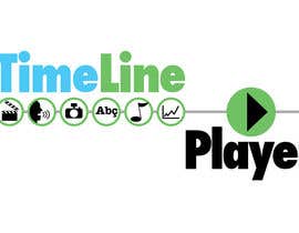
Design a Logo for TimeLine Player

  • สถานะ: Closed
  • รางวัล: $50
  • ผลงานที่ได้รับ: 17
  • ผู้ชนะ: stanbaker

รายละเอียดการประกวด

I need a logo for "TimeLine Player", a web player for multimedia content presented in a date navigation format. You can see an animation of a customized player and timeline on this page:

http://podDVR.com

This brand logo is part of a family of sites/brands, so the logo should "fit in"... but does not have to be a copy/duplicate of any other logo. It should stand out with its own identity while still remaining compatible with the rest (especially color). The player itself is a product of:

http://VIZdex.com

and will be associated with:

http://TLSN.com
http://AnnotatedTimeLine.org


- MUST BE READABLE. Nothing so stylish it is hard to figure out. It should be CLEAR at a GLANCE.

- Choose a complementary BUSINESS color palette that catches your attention but is still pleasing to the eye. I DO NOT want anything too gaudy or garish. Or amateurish... if I think I can make it MYSELF, I will immediately reject the entry (because I do not want to do it myself but will not pay someone for THAT). I want a more professional "look".

- I would like to have some kind of integrated ICON/GRAPHIC in addition to the name/text, but it must somehow visually associate with the name.

- SIMPLER is better than COMPLEX. Don't just throw a bunch of clip art out there... have a reason for it. If it looks like something seen a thousand times, DON'T DO IT! Perhaps it just has clean lines, maybe it's made abstract in some way, I'm open to your creative ideas.

Please deliver the ORIGINAL ART files and exact font name(s) used so I can adapt the logo in the future if needed. At minimum, I want the LAYERED format (not flattened) files.

Here are a couple of previous contest-winning logos so you can get an idea of the kind of "look" I tend toward:

http://TLSN.com
http://VIZdex.com

LAST... I know you invest valuable time into this contest, so let's spend it well, OK? Please DO NOT just post a message just to look at your entry... I PROMISE, I will look at it. Feel free to ask specific questions, however... I will provide any clarification you need..

I appreciate your creativity and effort... good luck!

ทักษะแนะนำ

กระดานประกาศ

  • janithnishshanka
    janithnishshanka
    • 10 ปี ที่ผ่านมา

    anyway Good Luck for winner :)

    • 10 ปี ที่ผ่านมา
    1. MonamiSoft
      MonamiSoft
      • 10 ปี ที่ผ่านมา

      :D

      • 10 ปี ที่ผ่านมา
  • gluedtothescreen
    ผู้จัดการประกวด
    • 10 ปี ที่ผ่านมา

    While pleasing to the eye, it is hard to find #135 meeting ANY of the requirements. Really? Spending your time without bothering to understand what is being requested? Too many do that...

    • 10 ปี ที่ผ่านมา
  • cafebaguscom
    cafebaguscom
    • 10 ปี ที่ผ่านมา

    Please check #119

    • 10 ปี ที่ผ่านมา
  • sohelrana121739
    sohelrana121739
    • 10 ปี ที่ผ่านมา

    Please see #99. Do you want 3D logo? thanks

    • 10 ปี ที่ผ่านมา
  • sohelrana121739
    sohelrana121739
    • 10 ปี ที่ผ่านมา

    please see #89 & 90

    • 10 ปี ที่ผ่านมา
  • aswinson
    aswinson
    • 10 ปี ที่ผ่านมา

    Hello, I would appreciate it when you have a moment of free time to observe number 80 for feedback. Thank you and look forward to working with you in the near future.

    • 10 ปี ที่ผ่านมา
  • gluedtothescreen
    ผู้จัดการประกวด
    • 10 ปี ที่ผ่านมา

    Some good entries but I'm still looking for a distinctive "look".... so here's a little feedback:

    --- the logo MUST be readable. For example, 37 is OK but there is no A. Maybe the play button icon can be worked in some other way, or a different image altogether. Or 13 has an interesting green graphic but it is inside a senseless purple shape that is confusing, maybe that can be removed? Or 39 uses a callout, but it doesn't quite work... maybe something else will? But, these will NOT WIN as they are.

    (2 more parts below)...

    • 10 ปี ที่ผ่านมา
  • gluedtothescreen
    ผู้จัดการประกวด
    • 10 ปี ที่ผ่านมา

    --- Many are trying the EQUALIZER image... if done right, I can see where that MIGHT work... but most entries are putting too much emphasis on it, taking too much space, and adding distracting colors. BE CAREFUL

    --- Some have put music symbols in the logo. The TimeLine Player IS a multimedia player... and plays music PLUS other audio (talk) and media (photos, video, text, data, etc)... so, we need to EITHER represent other media types, too, or drop the music one. I'm thinking drop it.

    • 10 ปี ที่ผ่านมา
  • gluedtothescreen
    ผู้จัดการประกวด
    • 10 ปี ที่ผ่านมา

    PART 2:

    --- A timeline icon should be integrated into the logo, even if small and lacking great detail. I want that image to be conveyed. ONCE AGAIN, I recommend you read the brief and VISIT THE LINKS so you can see the STYLE and TIMELINE appearance that we are infusing into this brand.

    At this time, I'm going to reject all 1-star entries to keep the list down to a viewable amount. Don't take it personally... this is just so I can manage the entries. My ratings will reflect my preferences among the rest.

    thanks for your time and effort!

    • 10 ปี ที่ผ่านมา

แสดงความคิดเห็นเพิ่มเติม

วิธีเริ่มต้นจัดการประกวด

  • ประกาศการประกวดของคุณ

    จัดการประกวดของคุณ รวดเร็วและง่ายดาย

  • รอรับผลงานจำนวนมหาศาล

    รอรับผลงานจำนวนมหาศาล จากทั่วโลก

  • มอบรางวัลให้แก่ผลงานที่ดีที่สุด

    มอบรางวัลให้แก่ผลงานที่ดีที่สุด ดาวน์โหลดไฟล์ - ง่ายดาย!

โพสต์การประกวดตอนนี้เลย หรือเข้าร่วมกับเราวันนี้!