ebook cover

  • สถานะ: Closed
  • รางวัล: $110
  • ผลงานที่ได้รับ: 51
  • ผู้ชนะ: irenevik

รายละเอียดการประกวด

Hi! I run a web analytics agency in Australia. I typically hire on Upwork, so feel free to see my client rating on there. This time I thought I would try out freelancer.com.

I am looking for an ebook cover:

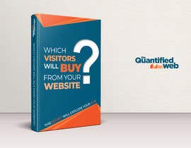
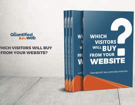
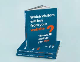
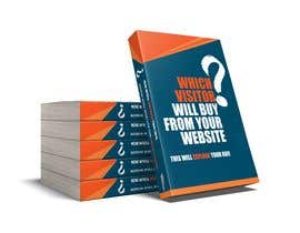
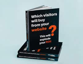
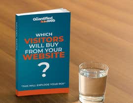
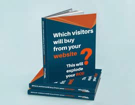
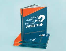
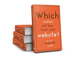
Title: Which visitors will buy from your website?
Caption: "This secret will explode your ROI!"

See similar example #1: https://kingkong.com.au/free-report/
See similar example #2: https://marketingsecrets.com/blackbook

See my attachments for my logo and branding colours etc.

Are you able to create this ebook cover for me?
I also have a whole lot of e-product covers that I need as well. I'll have a whole suite of additional things for the winning person to do that I'll pay for separately.

Please note: The logo etc are for colour and style guide, the logo is not required on the cover of the book, although the spine might be a nice touch. I want it to look like a normal printed book, not like a piece of advertising material.

Please make the book face to the right like the two examples shown

ทักษะแนะนำ

คำติชมจากผู้ว่าจ้าง

“It has been great working with Iryna!”

รูปประจำตัว petramanos, Australia.

ผลงานอันดับสูงสุดจากการประกวดนี้

ดูรายการเพิ่มเติม

กระดานประกาศ

  • petramanos
    ผู้จัดการประกวด
    • 5 ปี ที่ผ่านมา

    Thanks everyone! I decided to award to Iryna with design #63 !

    Oluwatobi - I appreciate you making so many entries, but I think I would find that hard to work with in my next projects. Iryna and Arun knocked it out of the park on their first go which makes my life easier

    • 5 ปี ที่ผ่านมา
    1. DJaySEAN
      DJaySEAN
      • 5 ปี ที่ผ่านมา

      fair enough; I like the challenge - I also wanted to show you how fast i could be with making edits and how resilient my work force could be when it comes to getting the job done. Congratulations to Iryna with Entry #63

      • 5 ปี ที่ผ่านมา
    2. irenevik
      irenevik
      • 5 ปี ที่ผ่านมา

      Thank you for appreciating my work!

      • 5 ปี ที่ผ่านมา
  • DJaySEAN
    DJaySEAN
    • 5 ปี ที่ผ่านมา

    oh my, I'm back on 4-stars.. looks like I need to re-design... I would submit a new entry in a bit but can I get a comment? What changes would you like to see so I can submit something better?

    • 5 ปี ที่ผ่านมา
  • redAphrodisiac
    redAphrodisiac
    • 5 ปี ที่ผ่านมา

    Please take a look at #61 and #62 ! Thanks

    • 5 ปี ที่ผ่านมา
  • petramanos
    ผู้จัดการประกวด
    • 5 ปี ที่ผ่านมา

    I'm quite fond of Iryna's design #56 - I like the fact that it is on brand, uses suitable typography, doesn't have brush strokes or other distractions, I like the colour choices of the different words and I like the fact that the question mark is not distracting from the core text. The only thing I don't like about this image is the fact that the design is quite two dimensional and I would really like it to look more three dimensional with the book facing towards the right like in the examples I provided and some of the other covers that I have rated highly

    • 5 ปี ที่ผ่านมา
    1. irenevik
      irenevik
      • 5 ปี ที่ผ่านมา

      Thank you for the feedback! I'll make the changes and provide a new version soon. Please, don't close the contest too early. And yeah, there was a typo with my entry number:)

      • 5 ปี ที่ผ่านมา
  • marketplase98
    marketplase98
    • 5 ปี ที่ผ่านมา

    please check #60

    • 5 ปี ที่ผ่านมา
  • petramanos
    ผู้จัดการประกวด
    • 5 ปี ที่ผ่านมา

    Hi Everyone, I've updated my profile now, didn't realise it was missing sorry

    • 5 ปี ที่ผ่านมา
    1. DJaySEAN
      DJaySEAN
      • 5 ปี ที่ผ่านมา

      Glad to see a face - I'm uploading a new design now - I decided to change the look of my mock-up file too just to give my designs a different feel. I'd love to get your comment/review

      • 5 ปี ที่ผ่านมา
  • irenevik
    irenevik
    • 5 ปี ที่ผ่านมา

    Dear Sir, please, take a look at #43 . I've created this eye-catching design based on your logo & stationery guides. I hope you'll like it. Please, let me know what you think. Thank you.

    • 5 ปี ที่ผ่านมา
  • petramanos
    ผู้จัดการประกวด
    • 5 ปี ที่ผ่านมา

    Hi Everyone, I asked Arun from #43 to add the word 'secret' into the caption. I think the caption reads better now, so I will update the brief to request the word secret in the caption. Sorry to everyone who followed my original request

    • 5 ปี ที่ผ่านมา
    1. DJaySEAN
      DJaySEAN
      • 5 ปี ที่ผ่านมา

      taken note of - new entry submitted

      • 5 ปี ที่ผ่านมา
  • petramanos
    ผู้จัดการประกวด
    • 5 ปี ที่ผ่านมา

    I'm really happy with #43 so I might call it early as I have a lot of other product designs to get out in a short timeframe. I'll call the winner in 24 hours. Thanks everyone for all your awesome designs and efforts in this competition.

    • 5 ปี ที่ผ่านมา
  • piveterr4
    piveterr4
    • 5 ปี ที่ผ่านมา

    I would very much like to know the color of your logo.

    • 5 ปี ที่ผ่านมา
    1. petramanos
      ผู้จัดการประกวด
      • 5 ปี ที่ผ่านมา

      Its in the brief

      • 5 ปี ที่ผ่านมา
  • sohidulsojib22
    sohidulsojib22
    • 5 ปี ที่ผ่านมา

    please check #40

    • 5 ปี ที่ผ่านมา
  • petramanos
    ผู้จัดการประกวด
    • 5 ปี ที่ผ่านมา

    Arun #37 is excellent, you have paid attention to my branding document! This is my new favourite. Can the background be removed?

    • 5 ปี ที่ผ่านมา
    1. iamyesarun
      iamyesarun
      • 5 ปี ที่ผ่านมา

      Hello, thanks.. Yes the background can be replaced/removed...

      • 5 ปี ที่ผ่านมา
  • petramanos
    ผู้จัดการประกวด
    • 5 ปี ที่ผ่านมา

    With #32 I like the simplicity of this design and I like the pile of books sitting behind it. I'm preferring the chunkier fonts of some of the other designs though, and I'm prefering designs that don't have my logo on the front cover (I do like it on the spine)

    • 5 ปี ที่ผ่านมา
    1. sohidulsojib22
      sohidulsojib22
      • 5 ปี ที่ผ่านมา

      thanks for your feedback and i'm fixing the design as your suggestion please wait for my another entry regards

      • 5 ปี ที่ผ่านมา
  • petramanos
    ผู้จัดการประกวด
    • 5 ปี ที่ผ่านมา

    #33 thanks for removing the logo on the front and for making the fonts bolder

    • 5 ปี ที่ผ่านมา
    1. rashedul070
      rashedul070
      • 5 ปี ที่ผ่านมา

      I think i can not fulfill your requirements properly. For this i should leave this contest. Thank you so much for comment in every entry. Hope you will get your desire design. Best Of luck :)

      • 5 ปี ที่ผ่านมา
  • petramanos
    ผู้จัดการประกวด
    • 5 ปี ที่ผ่านมา

    #33 Thanks, I did like your original better except for the background because I like it facing to the right

    • 5 ปี ที่ผ่านมา
  • petramanos
    ผู้จัดการประกวด
    • 5 ปี ที่ผ่านมา

    Here's another little thing to think about - the most important words in the heading is "which visitors" and the most important word in the subheading is "explode"

    • 5 ปี ที่ผ่านมา
  • petramanos
    ผู้จัดการประกวด
    • 5 ปี ที่ผ่านมา

    My favourite at the moment is #28 because its easy to read, is simple, but stylish, has the logo on the spine instead of the front, the font chosen is heavy and bold, the book faces the right, the book is not displayed at an unusual angle, and the additional books do add a nice touch, although might not be necessary for the final design. I do like them in this design though. I would like it even more if it was blue instead of black

    • 5 ปี ที่ผ่านมา
  • petramanos
    ผู้จัดการประกวด
    • 5 ปี ที่ผ่านมา

    These are looking great thankyou. I hope all the runners up in the competition can use their book covers in their own self promotion activities as demos of their work as they reflect well of your abilities

    • 5 ปี ที่ผ่านมา
  • sohidulsojib22
    sohidulsojib22
    • 5 ปี ที่ผ่านมา

    please check #32

    • 5 ปี ที่ผ่านมา
  • petramanos
    ผู้จัดการประกวด
    • 5 ปี ที่ผ่านมา

    Oluwatobi, I've ranked up your design #20 . I like your concept, the angle, the main book being on the right, the stack of books behind, the question mark on the spine and the colour pallette of blue background. The title and subtitle of the book still need to be more bold or bigger and a higher contrast from the background

    • 5 ปี ที่ผ่านมา
    1. DJaySEAN
      DJaySEAN
      • 5 ปี ที่ผ่านมา

      Sending in an update.

      • 5 ปี ที่ผ่านมา
  • petramanos
    ผู้จัดการประกวด
    • 5 ปี ที่ผ่านมา

    With #29 , this cover is quite good, but I really am not keen on the unusual backwards angle with the book standing on one tip.

    • 5 ปี ที่ผ่านมา
  • petramanos
    ผู้จัดการประกวด
    • 5 ปี ที่ผ่านมา

    I like #28 a lot, is there any chance of making it navy rather than black?

    • 5 ปี ที่ผ่านมา
  • petramanos
    ผู้จัดการประกวด
    • 5 ปี ที่ผ่านมา

    With #30, I'm not keen on the backwards angle of the book, or the colours or the fonts

    • 5 ปี ที่ผ่านมา
  • petramanos
    ผู้จัดการประกวด
    • 5 ปี ที่ผ่านมา

    I'm not keen on the skinny question mark in #26 sorry

    • 5 ปี ที่ผ่านมา
  • petramanos
    ผู้จัดการประกวด
    • 5 ปี ที่ผ่านมา

    I have rejected 27 because it is not a book cover

    • 5 ปี ที่ผ่านมา
  • petramanos
    ผู้จัดการประกวด
    • 5 ปี ที่ผ่านมา

    Samin I like your #24 more than #23 thankyou, let me mull it over. I like the fact that the type is easy to read and high contrast, I'm finding the background a little distracting. Overall its on target.

    • 5 ปี ที่ผ่านมา
    1. samimkeremsayin
      samimkeremsayin
      • 5 ปี ที่ผ่านมา

      thanks. I will soften the background. :)

      • 5 ปี ที่ผ่านมา
    2. samimkeremsayin
      samimkeremsayin
      • 5 ปี ที่ผ่านมา

      please check #25 :) If you want, I can further refine the question mark.

      • 5 ปี ที่ผ่านมา
  • petramanos
    ผู้จัดการประกวด
    • 5 ปี ที่ผ่านมา

    OK the recent offers are getting much improved, thankyou everyone!! OK, Samim I like your #23 and you have the right angle for the book in this one. I also like the fact that you have removed the logo from the front as I think it looks cleaner without the logo. I think the background question mark could do with being a little more subtle and the main title font a little less blurry. Is it the texture? I do like the stack of books, but it would be better if the main book face was on the right rather than the left so that I can put the main copy of the page on the right. But overall this image could be adequate for my purposes. Thankyou for continuing to refine your offer.

    • 5 ปี ที่ผ่านมา
  • piveterr4
    piveterr4
    • 5 ปี ที่ผ่านมา

    IT'S OK. Can you send the color of your logo with the #?
    And please tell me what you wanna see. It's hard to know what you like. I really enjoyed all the designers, but every person has their personal taste.

    • 5 ปี ที่ผ่านมา
  • samimkeremsayin
    samimkeremsayin
    • 5 ปี ที่ผ่านมา

    please check #24 :)

    • 5 ปี ที่ผ่านมา
  • petramanos
    ผู้จัดการประกวด
    • 5 ปี ที่ผ่านมา

    I would reconsider something like #7 if there was no rock, it wasn't up on its tip, and my logo was made less prominent

    • 5 ปี ที่ผ่านมา
    1. petramanos
      ผู้จัดการประกวด
      • 5 ปี ที่ผ่านมา

      I don't want a background... and I really don't want a book on its tip. Please see the direction and angles of the two example links I provided in the brief

      • 5 ปี ที่ผ่านมา
    2. samimkeremsayin
      samimkeremsayin
      • 5 ปี ที่ผ่านมา

      I understand. I am changing please wait.

      • 5 ปี ที่ผ่านมา
  • petramanos
    ผู้จัดการประกวด
    • 5 ปี ที่ผ่านมา

    Hi Oluwatobi ( #17 ) - thanks for the edit, although you swapped out the parts that I liked in your design #6 . I liked the colours and the layout and the big question mark. I liked the stack of books behind with the question mark on the spine. I would have liked the caption to be bigger on #6 , and the logo removed from the front cover but put on the spine instead. But the logo should be tilted so that it fits horizonally on the spine, or alternatively just the graphical part of my logo on the spine

    • 5 ปี ที่ผ่านมา
    1. DJaySEAN
      DJaySEAN
      • 5 ปี ที่ผ่านมา

      thanks for the feedback; I'd get to it right away

      • 5 ปี ที่ผ่านมา
  • petramanos
    ผู้จัดการประกวด
    • 5 ปี ที่ผ่านมา

    Thanks for all the designs everyone, very appreciated

    • 5 ปี ที่ผ่านมา
  • petramanos
    ผู้จัดการประกวด
    • 5 ปี ที่ผ่านมา

    #12 , #13 and #15 are all essentially similar mockups, but I prefer #12 because I think the blue makes a better background colour than the orange, and I don't really like the orange triangles on the corners of #15

    • 5 ปี ที่ผ่านมา
  • petramanos
    ผู้จัดการประกวด
    • 5 ปี ที่ผ่านมา

    #12 and #6 are my favourites so far. With #12 the background needs to be removed and the logo needs to be less prominent. But I do like the fact that it faces the right, the design is clean and simple, the font is easy to read and the colours are on brand

    • 5 ปี ที่ผ่านมา
  • petramanos
    ผู้จัดการประกวด
    • 5 ปี ที่ผ่านมา

    I prefer the books that tilt slightly towards the right like #6 and #4 - please see two examples I provided. I would like the books to be about the same shape and slant angle as those as they slant towards the text on the page

    • 5 ปี ที่ผ่านมา

แสดงความคิดเห็นเพิ่มเติม

วิธีเริ่มต้นจัดการประกวด

  • ประกาศการประกวดของคุณ

    จัดการประกวดของคุณ รวดเร็วและง่ายดาย

  • รอรับผลงานจำนวนมหาศาล

    รอรับผลงานจำนวนมหาศาล จากทั่วโลก

  • มอบรางวัลให้แก่ผลงานที่ดีที่สุด

    มอบรางวัลให้แก่ผลงานที่ดีที่สุด ดาวน์โหลดไฟล์ - ง่ายดาย!

โพสต์การประกวดตอนนี้เลย หรือเข้าร่วมกับเราวันนี้!