I need some Graphic Design

  • สถานะ: Closed
  • รางวัล: $43
  • ผลงานที่ได้รับ: 25
  • ผู้ชนะ: ldburgos

รายละเอียดการประกวด

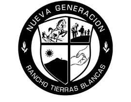
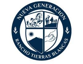
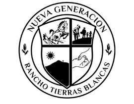
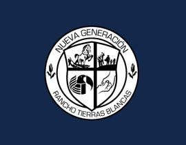
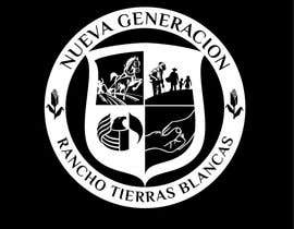
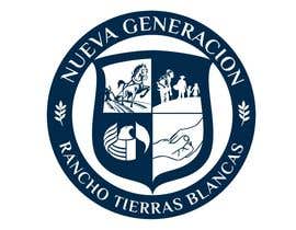
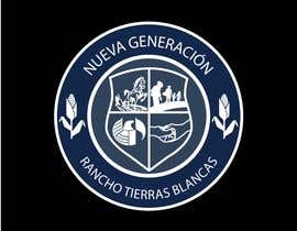
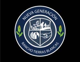
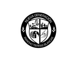
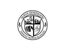
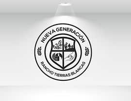
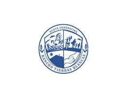
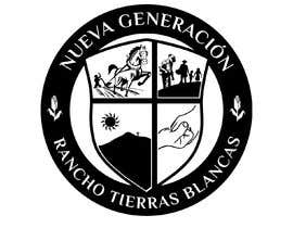
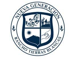
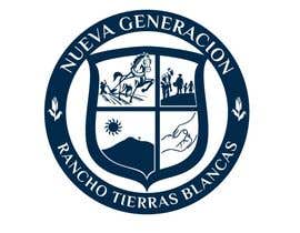
First of all, I want to say thank you for your help in advance. I’m looking for an outstanding individual with proficient logo skills. My organization has an idea of what they’re looking for, I attached a "desire crest photo" on the desired images folder. The four images in the center represent our core values and I would like to use the images attached to create the masterpiece. Feel free to use your creativity as I will present the work to our panel before we decide on the finalist. Please make it professional and clean, we’re open to a full-color stamp as well as a two-color only options including but not limited to white, black, navy blue and gray.

On the top of the crest it should read:

NUEVA GENERACIÓN

On the bottom of the crest it should read:

RANCHO TIERRAS BLANCAS

SHOULD LOOK LIKE OR SIMILAR TO :
https://drive.google.com/open?id=1TFsA6v3xzVtrD4nNmI2VV1Jv1Y3on6jW

IMAGES TO USE:
https://drive.google.com/open?id=1SkpCB-S6wguYQ8cT2T_piIglKgYPQ1-4

OTHER SIMILAR IMAGES:
https://drive.google.com/drive/folders/1Q05zeYgkLATS1c-B1zW9MdRfladRZo16?usp=sharing


Depending on the quality of work and service the organization is willing to include a tip.


If you have any questions please feel free to contact me.

Thank you!

-SLY

ทักษะแนะนำ

คำติชมจากผู้ว่าจ้าง

“Outstanding work! Very professional, will definitely hire again. A+++”

รูปประจำตัว techsol831, United States.

ผลงานอันดับสูงสุดจากการประกวดนี้

ดูรายการเพิ่มเติม

กระดานประกาศ

  • techsol831
    ผู้จัดการประกวด
    • 5 ปี ที่ผ่านมา

    Good day everybody! Thanks again for all your hard work, I ran the design through the board for approval and they wanted me to make some changes: Please see attached link below: https://drive.google.com/open?id=1XFbgu85m0iRBy-YCbODTaLzRNFd4Oxkp in quadrant three they want the town's volcano as shown on the example. If you look at the detail please include the sun and the cross that is found in the same exact position. Also, if you look at the small logos in all four quadrants make sure there is a bit of buffer space from the images and the vertical and horizontal lines of the crest. Thank you once again!

    • 5 ปี ที่ผ่านมา
  • juancarlosgutrrz
    juancarlosgutrrz
    • 5 ปี ที่ผ่านมา

    Check #57 with modern font

    • 5 ปี ที่ผ่านมา
  • Future designs
    Future designs
    • 5 ปี ที่ผ่านมา

    please check #48 #49 #50

    • 5 ปี ที่ผ่านมา
  • techsol831
    ผู้จัดการประกวด
    • 5 ปี ที่ผ่านมา

    On the sides (left and right) where the leaves are can we go ahead and replace them with the following: https://drive.google.com/open?id=1BTreGKaA7G9QK44Ho454l36WG7xCDO1c

    • 5 ปี ที่ผ่านมา
  • techsol831
    ผู้จัดการประกวด
    • 5 ปี ที่ผ่านมา

    PLEASE DONT FORGET TO USE THIS TYPE OF FONT : https://drive.google.com/open?id=1w_AsLW05IjZucAcD2q2FvBh8vqyoctJG

    • 5 ปี ที่ผ่านมา
  • techsol831
    ผู้จัดการประกวด
    • 5 ปี ที่ผ่านมา

    I AM ALSO OPEN TO DIFFERENT CONCEPTS, FEEL FREE TO SUBMIT FOR REVIEW. THANK YOU

    • 5 ปี ที่ผ่านมา
  • Future designs
    Future designs
    • 5 ปี ที่ผ่านมา

    please check #10

    • 5 ปี ที่ผ่านมา
    1. techsol831
      ผู้จัดการประกวด
      • 5 ปี ที่ผ่านมา

      The lines look too thick, can you please use some of the fonts shown above and also make it more modern.. maybe even trying to use two colors white and the blue shown here: https://drive.google.com/open?id=1ByxPC0aUEtsvUbvXG3HpY5oSY4SoEYtA

      • 5 ปี ที่ผ่านมา
  • creative8idea
    creative8idea
    • 5 ปี ที่ผ่านมา

    My entry #1

    • 5 ปี ที่ผ่านมา
    1. techsol831
      ผู้จัดการประกวด
      • 5 ปี ที่ผ่านมา

      Please try to enlarge the four values just the way its shown on the provided sample: https://drive.google.com/open?id=1TFsA6v3xzVtrD4nNmI2VV1Jv1Y3on6jW

      • 5 ปี ที่ผ่านมา
  • techsol831
    ผู้จัดการประกวด
    • 5 ปี ที่ผ่านมา

    https://drive.google.com/open?id=1w_AsLW05IjZucAcD2q2FvBh8vqyoctJG

    • 5 ปี ที่ผ่านมา
  • techsol831
    ผู้จัดการประกวด
    • 5 ปี ที่ผ่านมา

    SOME OF THE FONTS TO USE:

    • 5 ปี ที่ผ่านมา
  • techsol831
    ผู้จัดการประกวด
    • 5 ปี ที่ผ่านมา

    I see a lot of black and white, can we please try a variety maybe adding some white, gray, and blues also I'd like the font to stand out, using some of the following or similar would be awesome.

    • 5 ปี ที่ผ่านมา
  • techsol831
    ผู้จัดการประกวด
    • 5 ปี ที่ผ่านมา

    Please show me your entry

    • 5 ปี ที่ผ่านมา
    1. creative8idea
      creative8idea
      • 5 ปี ที่ผ่านมา

      Check Entry #1

      • 5 ปี ที่ผ่านมา
  • creative8idea
    creative8idea
    • 5 ปี ที่ผ่านมา

    Hello, I have read your description very confidently and thinking I can do this if you hire or contact me. I have previous experience in logo design. You can check my portfolio: https://goo.gl/Fds3dA

    • 5 ปี ที่ผ่านมา

แสดงความคิดเห็นเพิ่มเติม

วิธีเริ่มต้นจัดการประกวด

  • ประกาศการประกวดของคุณ

    จัดการประกวดของคุณ รวดเร็วและง่ายดาย

  • รอรับผลงานจำนวนมหาศาล

    รอรับผลงานจำนวนมหาศาล จากทั่วโลก

  • มอบรางวัลให้แก่ผลงานที่ดีที่สุด

    มอบรางวัลให้แก่ผลงานที่ดีที่สุด ดาวน์โหลดไฟล์ - ง่ายดาย!

โพสต์การประกวดตอนนี้เลย หรือเข้าร่วมกับเราวันนี้!