leodesigner2
Pakistan

We need a modern logo for christian community. I add some examples of logos found in the internet that I like but it is only a suggestion. It shouldn't be overcomplicated and should fit well on a fanpage, printed posters, social media materials etc.
This christian community members and leaders are mainly families with childrens, gathering together for worship events and other activities. Because it is usually a hard time for parents with newborns, active little ones or growing up youth to stay "on tracks" they have a place to rest and strenghten in Christ to continue their important mission.
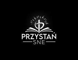
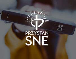
The name is in polish - "Przystań SNE" - and its first part can be translated as "safe harbor". A landing place when you can stop by for a moment, repair your ship, refill equipment, food containers and then go back to the ocean of life because ships are not built to permanantly stay in harbors ;) [these are just a metaphor, we don't even have a lake nearby ;) ]
For this reason I like the attached example with an anchor and the cross - some kind of connection of harbor/ship element, the cross and maybe waves should be added instead of blocks ;) Like "anchored in Christ" symbol :) Once again, it's only a suggestion. Maybe your idea will be more creative to present described message :)
Second part of the name are 3 uppercase letters - an acronym of mother-community. It can be added or can be skipped in the logo. To be discussed.
It would be a great bonus if you are able to animate it somehow for use as fade-in or fade-out element of videos.
Below you can find a copy of my general comments because not everyone checks Comments section before starting new design:
----------------------
If your font doesn't have Ń please use original N from the font and add ' above the N manually. It ruins the visual effect if Ń is from different font (usually not matching the rest of the text)
----------------------
To all designers posting their entries - if you can see comments on other entries that are not rejected - please read them.
For example there are a lot of entries with mountains which is probably caused by a logo with mountains that was not rejected for quite long time. On that logo I have commented that I like the style and not the mountains as a sign. We DON'T want mountains in our logo.
There are a lot of symbols/sings in the Bible like a rock, living water, a tree, a sheep, a seed.. but our name is Przystań (can be translated as a harbor) and it is already a metaphor. We can't use one thing in the name and completely different thing in the sign. Thank you.
P.S. maybe you could try with some arrangement of "christian fish" sign instead of trees, mountains etc? ;)
“Yasmeen added eye-catching, interesting entry for our logo contest. Very good communication and quick response to suggestions. I like the final result :) ”
![]() eereck, Poland.
eereck, Poland.


จัดการประกวดของคุณ รวดเร็วและง่ายดาย

รอรับผลงานจำนวนมหาศาล จากทั่วโลก

มอบรางวัลให้แก่ผลงานที่ดีที่สุด ดาวน์โหลดไฟล์ - ง่ายดาย!
